The Avengers

Group shot of my Avengers so far. Will update this as I get more painted. Every time I get close to finishing this faction, they release like 5 more characters that I had no idea were even members of the team, so I'll probably always be working on this faction.
I will be going back and repainting some of the core set models like Iron Man, Black Widow, Captain Marvel and Captain America (as well as Vision) because I've come a long way as a hobbyist since starting this project and I feel those paint jobs are below my standards for what I can do now.
When I started the project I was trying to crank out some minis and I experimented with using mostly contrast paints. Later on I leaned more towards focusing on contrast as a paint technique (highlighting all the way to white and shading nearly to black on every color) and trying to make smoother transitions (including testing out wet blending). Due to this, I've grown a lot as a painter since starting and now painting is my main source of enjoyment out of the hobby. It's been quite the journey.
For this blog I will mainly focus on the main themes of the project and my journey with each miniature. If you want more detailed information on each individual miniature, That blog is here: https://www.beastsofwar.com/project/1490419/#snav
Shots of the individual miniatures from different angles below.
Captain America (Steve Rogers)
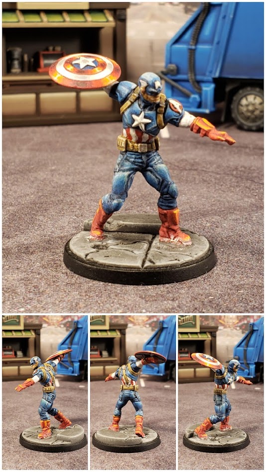
Then a funny thing happened. When I was working on reds and blues in the assembly line and I got to Captain America I realized I didn't want his shield to just look like a base coat and I had no idea how to go about highlighting it. I did a small bit of googling and found a YouTube guide on painting Captain America by Sorastro. I watched it and even though the shield looked well outside my skill level I tried to generally use the guide to paint his shield.
Along the way I also noticed that Sorastro would only highlight the model where it mattered. So for instance the arm under Captain America's shield wouldn't get highlighted at all. It would get a base coat and that was it. He would also highlight everything to white. Neither of those ideas had ever even occurred to me, but I thought I'd try them out as Sorastro's models looked so much better than mine.
I was blown away by how good it looked. I was putting less paint on the model and hence painting faster than I had ever painted and it looked magnitudes better than anything I had ever painted. This became the source of inspiration for my project and I switched from wanting to crank out minis with contrast paints to wanting to work on high contrast style paintjobs and smoother transitions. I quickly dropped all my other projects and I've been solely painting MCP ever since, trying to get caught up to their release schedule.
During COVID Atomic Mass Games decided to do an online paint competition and Sorastro was one of the judges. I decided to enter Cap and I took Gold. It was a relatively small competition and there were a few gold place winners, one of whom took best of show, but regardless, that was really exciting for me and even though when I look at Cap I see a lot of things I would change (and will when I paint my second core set), I'm still really proud of him and he kind of encapsulates everything this project has become for me.
Captain America (Sam Wilson)

Due to my experience with Domino, Warmachine, Quicksilder, Amazaing Spider-Man, etc. I've become very comfortable with explosions, that part of Sam was really routine at this point and not worth getting into. If you want to read up on my process with those, I would recommend checking out my comments on one of those models.
Also with Sam, I had the benefit of just finishing my Iron Man repaint and that taught me a lot about how I can use white when highlighting red without turning the whole thing pink. I'm pretty happy with how his red turned out. I feel it captures red and has depth without looking like a different color. In retrospect, I think I could've gone darker with it in places, but I think it works well enough.
The real test on Sam was seeing if I could do a better job on his shield than I did on Steve's shield and oh boy did I. I have a separate blog post on that for those intersted. Suffice it to say, I've been holding Steve's shield up as an example of how much better of a painter I've become for a couple of years now and I officially have to retire that thought because I think Sam's shield puts it to shame. It's a pretty proud moment for me.
Ant-Man

Ant-Man was surprisingly challenging to paint. I didn't want his red to look like my normal reds. I wanted it to have a more orangey feel to it, while not actually being orange, so I used oranges and yellows in my highlights instead of mixing in whites. I'm also trying to do more NMM with this project, so I tried to do that with all the gray/metal bits. I didn't care for the little rock the mini version was running up as I don't feel it really gives a good scale to how small it is, so I decided to add a button, which I think really sells how small he is. In retrospect I should've done NMM on his button, but honestly I'm not sure I'm ready for that level of NMM yet.
Beast

Beast was really fun to paint. Blue has always been a fun and rewarding color to paint. I was a little worried that highlighting everything to white was going to look weird since he's almost entirely organic, but I think it turned out really well. I also painted Beast after I learned to be more realistic about highlighting musculature and I think it really shows. I still struggle with it and you can tell on his back muscles where I kind of defaulted into highlighting them like flat panels, but I think on the arms and legs I moved away from that and the highlighting looks much more natural.
Black Panther

Black Panther was the first black model that I felt I did justice on. My work with him is what made me think I was ready to tackle Venom. Of course in retrospect I wish I had used either dark blues for the highlights or in his case dark purples. I will be using dark blues going forward on most of my blacks. He's also one of the minis that made me realize my top down shading of muscles, although it doesn't look terrible, doesn't quite look right either. It's not the natural way light would hit the muscles. I started to correct for this when I painted venom and I've gotten progressively better at it with each mini. I really worked on my transitions with him and for a black model that's highlighted with grayscale, which I'm now avoiding as I think it's too difficult to get good transitions with, I think Black Panther's transitions are actually rather well done. I'm also really happy with how even though he's a completely monochrome paint job, there is still a ton of depth to him. He was a really valuable painting experience for me on this journey.
Black Widow

If there is any model I cringe at every time I look at them, it is this model. This model was a victim of being one of my first in this project and my first attempt at painting a mostly black model. My aims for this project were very different when I first started and drastically shifted as I was painting the core set models. That transformation mainly happened because of my experience painting Cap, so I'll go into that detail when I talk about him, but long story short, I started Black Widow by slobbering GW contrast paints onto her as a basecoat and then decided I wanted to paint everything in high contrast style, highlighting to white and shading to either pure black or near it and Black Widow being my trial run at doing this with black really didn't help. I've already purchased another core set and she will definitely be one of the models that gets a repaint. I want to prioritize new models first though, so it might be a while.
Black Widow, Agent of S.H.I.E.L.D.

Painting Black Widow 2.0 was a weird experience because it was like a mirror universe version of the experience of painting Core Widow. Painting Core Widow was a frustrating and painful experience because it was my first time trying to do a high contrast paint job on a predominately black miniature and it was horrible. I had no idea how to highlight black and it really shows. This time having the experience of painting black so many more times and getting a good feel for how to do it dare I say "well", this went very smoothly and felt really good the whole time.
I'm overall very happy with how she turned out and I'm more upset with my inability to take good pictures of black miniatures than I am anything about her paint job. The only real painting critique I have of her right now is I don't think the NMM of the gauntlets look right. It's such a small area to work with that I'm not sure what I would do differently, but something about it looks off. I suspect it's the top of the gauntlets and how they just reflect the sky and so you don't really get the ground/sky effect.
Blade

Where to start with Blade. For one, he was experimental in almost every sense of the word. From a modelling standpoint, a color choice standpoint and a paint process standpoint.
For the modelling, I really dislike that the vampire hands come out of concrete as I think it looks silly and ruins my immersion, so I wanted to change that. I wasn't quite sure how I was going to go about fixing that as I think the vampire hands themselves are really cool and it creates a very iconic pose from a comic cover and I wanted to retain that. What I ultimately ended up doing was sanding down the concrete off of a regular flat base and using liquid green stuff to try to smooth out the top and get rid of any gradient so that I could attempt to just make the base look like darkness with smoke/blood magic/whatever coming out of it. I also had just gotten in my Dormammu and I ended up with extra bits of flame that I felt worked fairly well as just more smoke so the base would be less empty. Overall I think this part of it turned out really well.
The color choice is another matter entirely. Originally I was leaning towards either a purple or a green for the smoke/magic/whatever with the vampire hands coming out of it. My wife suggested doing it in red, what with the vampire theme and all. I decided that made sense and went for it. My only real issue here is it feels very, very monochromatic and I'm not sure I care for it. I suspect I would've been happier with purple to break up the model more. However, he is Blade and he is a vampire hunting other vampires, so it does feel very "in theme", so I'm not going to sweat this too much. I do have a second copy coming as a Christmas present from a friend, so I might try another version with a different color for the smoke and see how that works.
As far as the painting process itself, I have very mixed feelings. Black is becoming more comfortable for me to paint and I'm pretty happy with how that turned out on him. I feel like I'm getting a lot better at highlighting things naturally and getting away from my habit of treating everything as a panel and shading from one end to the next. The NMM on his swords also felt more comfortable, but I almost feel like you have to throw in a light blue for NMM steel to really look right, which I think it unfortunate as it doesn't fit here, so I didn't do it. Thus, something about his swords doesn't feel "right" to me and other than adding a light blue, I'm not sure what to do about it. Finally the OSL was something I was really anxious about. I was really worried it would mess up the paint job and I can't really tell if I dislike the actual OSL or if I just don't care for the monochromatic nature of red as a color choice for the OSL on this model. It feels a bit heavy handed and part of me wonders if I'm rushing my point jobs because I'm trying to finish my backlog.
Overall I think he looks much better than what I could've accomplished a couple years ago and the fact that I look at him and see lots of things I wish I had done differently proves that I'm really pushing myself as a painter, so I guess I should put that in the win column. At any rate, I'm actually really excited to play Midnight Sons and now I'm only one painted model away from having the full faction painted, so I'm really excited about that.
Cable

Cable is the first of my minis to be painted after I switched over to Scalecolor paints. I have to say, I couldn't be more impressed with those paints. They have this weird quality where as you paint your layers the paints seem to blend into the layer before as if you were wet blending even though you weren't. It honestly felt like I couldn't screw up the models if I tried as I was painting. It was very surreal. I'm completely sold on the line and highly recommend them.
As far as Cable himself, I started off with the telekinetic shield, which was a mistake because I had glued everything in place before painting, so I had to spend the rest of the time painting around the barrier. I definitely will paint the barrier separately from Cable if I do future versions, which I'm planning to do another version in X-Force garb. I'm really happy with how the explosion and the bullets and the ripple effect on the barrier turned out. However, I think the OSL from the explosion on the ground is pretty weak and I didn't really realize that until I was painting Domino, which was the next model I painted. With her I experimented more because the "yellow" glow just wasn't working. I may go back in and rework his OSL on the ground due to this.
The one thing I've found about the Scalecolor paints that I would criticize is that their brightest white seems rather muted compared to other whites I've worked with. Due to this, I think he "pops" less than other minis I've painted and even the NMM has a more muted quality to it. This isn't necessarily a bad thing, but one of the main aims of this project is to take everything to white to get it to "pop". So I might have to switch over to a different brand for whites to get that effect back. I'll have to experiment with that in future paint jobs. I definitely used Sorastro's pdf guide on his website when painting this model. The "singed" look on the cape is a dead giveaway of that. That being said, I've found the more I paint the more I find myself preferring to go in different directions on some aspects of a mini than what I see the pros do. I'm particularly glad I went my own direction with the force barrier as I feel like I really pulled it off and I really prefer it to what Sorastro did.
Captain Marvel

To be completely honest. I do not care for this character, so I was expecting it to be a chore to paint. I could not have been more wrong. It is such a nice sculpt and was really fun to paint. I think my comfort with painting red and blue really helped with that. Although, I've since seen Sorastro's guide on her and when I do my core set repaint I'm definitely going to play with glowing fists and OSL. Really looking forward to the repaint, to be honest.
Deadpool

So I decided for my first Deadpool to go with the X-Force version. I did this because I was painting Cable, Domino and Deadpool one after the other for an upcoming tourney in which I'm running X-Force. I will be doing separate Deadpools in his classic uniform later, but I wanted to do his X-Force version this time around.
He benefitted from my switching to Scalecolor paints, which I think is why the blacks and grays came out so smooth compared to my previous attempts at black. The only criticism I have of that, which I mentioned when I talked about Cable, is that the white in Scalecolor seems kind of muted. I think I'm going to switch to another brand for my whites so I can get that "pop" effect back. That being said, I'm still really happy with how he came out and he'll be a new standard for me going forward when it comes to painting black. Although, I realized after the fact that I used Navy Blue instead of Abyssal Blue for my base, which is quite a bit brighter, which I think made the black more gray than it should be. I'll get a chance to correct him in future Deadpool paint jobs, so I'm interested to compare them to see how it changes how the black looks.
On a side note, I'm more than a little confused as to how Deadpool ended up on Avengers and yet not on X-Men. I wonder how much of the rosters are being dictated by gameplay versus lore.
Doctor Voodoo
Hawkeye

Hawkeye helped me grow a lot as a painter. I realized I wanted his pants to be blue, but I wanted it to be a darker blue, so I had a dilemma of how I highlight all the way to white without making it look chalky and overdone like what I've run into with my blacks on Black Widow or Red Skull. I decided to try to keep the highlighting minimal and hence keep a lot more of the dark color showing and I was really happy with how it turned out. I think without this experience I wouldn't be at a point to where I'm excited to repaint my black miniatures and my Miles Morales would probably look far worse than it does.
Hulk

Hulk is one of the few MCP minis I actually stripped as halfway through the paint job I realized the way I was going about highlighting it just didn't look right. Painting him made me realize that when highlighting muscles, you can't just treat them as a flat panel that goes from light up top to dark on the bottom. You need to treat it like a bunch of cylinders or orbs that have their bright and dark spots in logical places based on the shape of the muscle. Looking at the miniature now, there are many, many areas on the model where I still fell into that bad habit and it doesn't look quite right, but this is the model where I started to understand that as a concept and you can see the progress in some other miniatures like Beast and Venom, which I painted later.
Hulkbuster
Hulkbuster is now released and on it's way. Hopefully I'll have him painted up here in the next few weeks.
Iron Fist

I finished up Iron Fist just in time for a tournament. He was a far more intimidating model to paint in my mind then he was to actually paint. Once I got into painting him the work just kind of flowed and it was really fun. I'm not sure of how much I should equate this to the fact that I painted him entirely with Scale color paints. They flow so nicely and blend into each other so well that things that are normally difficult to paint, like pale flesh and fire, just kind of came together. I've noticed that I spend far less time when using Scale color analyzing my blends and trying to figure out how to "fix" them to blend together better. I've noticed that when I add a layer with them and it dries it looks almost like I wet blended, which is really surreal. They're quickly turning me into a Scale color salesman.
However, I also just got done doing explosions on Domino and Cable and working with flame effects on models like Ghost Rider, so a lot of this might be due to my being much more comfortable with painting those things. I think being in a hurry to get him done for a tournament actually helped me, because I already knew how I wanted to paint him and had experience with each of the things involved in painting him (flesh, osl, etc.) and had I just sat around looking at him with no "hurry up and get him done, you don't have a day left" mentality to push me into it, I think I would've agonized too much over how to paint him.
Iron Man

This was a very experimental paintjob for me. Originally I tried using white mixed into my base coat to highlight him and the pink that it brought to the paint job just felt very off. I stripped him halfway through and started over, this time focusing on just oranges and yellows to highlight the red. This is also my first real attempt at what is essentially NMM. I think it looks really gawdy and overdone, personally. I'm really excited to do a repaint of him because I think what' I've learned about highlighting red, NMM and keeping dark colors while still highlighting all the way to white will help out tremendously when painting him again, so I think the repaint is going to look loads better. However, I think painting him was an integral step in the process of discovering all of those things, so I'm glad I did it, even if I don't care for the results.
Iron Man - Repainted

Finally got Mr. Stark repainted. Painting him using everything I've learned since starting this project was incredibly rewarding. I really couldn't be happier with how he came out (for now anyway). I go pretty in-depth on that in my "Repaints" section for those interested. Now I'm ready to use these same techniques on Hulkbuster,
Luke Cage

Luke Cage was another model that I had like a day to complete before a tournament and I'm really happy with how he turned out, for the most part. I finally feel like I figured out how to paint jeans. However, in retrospect I think I didn't really get the lighting right on the side of the jeans. I'm also not entirely sure I prefer this recipe for yellow over the GW recipe I am used to using. I don't think it looks bad, per se, but it does feel very different. I think perhaps I'll just approach it from the perspective of it being two different yellows. White paints for Scale color I've noticed are very muted, so I intentionally switched to Citadel White when mixing in my highest higlights and I definitely think it helps with the "pop" effect I'm going for.
I'd say the biggest criticism I have of Luke is the lighting on the head. Bald heads are still a bit of a struggle for me, mainly because I'm not sure how to paint it so that it looks good from multiple angles. I tried to focus on lighting it to look best straight on, but I feel like doing so prevents it from looking right from the sides and I'm not sure if that's something that anything can be done about or if I've found a catch-22 with painting 3D models.
Ms. Marvel

Ms. Marvel was a really fun and quick paint job. That was in large part due to having spent the last few models painting up tons of NMM and OSL and doing very experimental paint jobs that were quite agonizing to get through. Ms. Marvel didn't really have any of that going on and I thought it was a good opportunity to just kind of turn my brain off and enjoy the journey.
One of the things I noticed when painting her was that often I feel compelled to try to bring each color all the way to white and to heavily shade it to near black, but I wasn't feeling that compulsion with Ms. Marvel. It made me notice that this actually happens quite frequently with models on this project. Sometimes I feel like I really need to bring everything to white, sometimes it doesn't feel necessary. I'm still not sure what this means exactly. Part of me thinks that as I've grown as a painter I'm realizing that it's really not necessary to bring everything to white and you can still get a really impressive paint job without it. Part of me thinks that I should be at least doing pinpoint white highlights in certain spots and shade darker than I do and that my paint jobs would look that much better if I did and I'm just getting lazy or forgetting the lessons I learned on so many other models about why I started doing this in the first place. I think I'm leaning toward the latter.
One thing I will say about what I learned with my process on her is that I think I'm starting to get a handle on red. Normally I really struggle with it, trying to find the right highlight colors and the right amount of highlighting to get it to look highlighted without it becoming a different color. I think the trick is to use darker reds for shading and to keep the highest points of highlighting, where you're really using non-red colors like orange, yellow or pink, very minimal. I think doing both of those things really gives the red some depth without making it look like it's orange or pink. It's such a puzzling color for me because so many times I feel like I've finally "gotten" it, and then the next time I paint it I feel like it's a completely different puzzle and the lessons learned from my previous attempt don't apply.
Quicksilver

Quicksilver is a victim of my laziness. I'm not terribly invested in the character and I was so close at the time of painting him to being done with my backlog and at 100% (for now) for this project that I just wanted to be done with him. Due to that, I didn't bother with OSL on him save for the rock he's stepping off of. Normally I would want to add that in as I think it really helps the model and makes it look that much better. I'm generally pretty happy with him. For critique I think the face looks a bit uninspired. In contrast I'm really happy with how the blue turned out. I was worried going in that the blue was either going to be too dark or over highlighted with washed out details and I feel like I kind of threaded the needle on that one and it's still got a light feel to it without feeling overdone on the highlights.
Reflecting on my laziness and not choosing to add OSL really tells me how far I've come as a painter. Before the very idea of doing OSL was incredibly daunting and only something that "those really good painters that make YouTube videos and win paint competitions do" and here I am making it a standard for my models that I do normally unless I'm feeling lazy. That's a cool feeling.
Scarlet Witch

I used Sorastro's pdf guide to paint Scarlet Witch and I'm very glad I did. Before deciding on his guide I went back and forth a few times on how to go about painting her and as a result she ended up with a couple of base coats on her, so I think her detail could be better. Also, I really wish I hadn't glued her to her magic effects before painting her.
The magic was annoying to paint, but I think the effect works really well and I really like how striking it is. It was achieved using "Brilli White" from Scalecolor over a white base coat and then painting Vallejo's Magenta Ink over that. The funny part is I think I didn't go very bright with her reds and pinks and I think that would've brought the model down, but the brightness of the magic really brings it together.
Speaking of brightness, I'm really struggling with white on Scalecolor and I think it's really obvious with Scarlet Witch. If I use the Scalecolor brand of white the blends are really smooth, but the white is very muted and I don't get that "pop" effect I'm looking for. Sorastro often uses Titanium White from PrimAcryl, which is a very powerful and bright white, which is great, but it doesn't blend in with the Scalecolor paints the way the Scalecolor brand white does, so I get the "pop" effect, but the blend kinda goes to crap. I've been really struggling with that and I'm still not sure what to do about it.
I'm really thankful to my wife on this one, who as politely and gently to me as possible, suggested that I should go up higher on the highlights on her face. I can be rather sensitive to criticism when I've just finished a mini and I'm in the mood to celebrate being done with it and my wife is an angel for weathering that storm and still helping me to improve by challenging me even when it's hard to do. Had she not given me that advice I don't think I'd have come up on her face and I think doing so really helped the model look a lot better.
With Scarlet Witch done my Defenders are complete (for now). I've only got another 10 models to go to be done with my backlog and with the news of indefinite delays on international shipping it loos like it's gonna be awhile until I get any new releases, so I really have no excuse for not finishing my backlog. Should probably be able to finish a bunch of terrain too.
She-Hulk

With She-Hulk I wanted to try something different with her skin. I saw her "canon" skin tone was a much lighter green, but I wanted to try going with a deep green. After playing with it quite a bit I ended up pulling off what I feel is a pretty cool deep green. Overall I think it was a good experience and helped me understand how to do darker colors effectively, but I don't think it looks very good on her model. Honestly I probably should've gone with the "canon" skin tone. Oh well, it was a fun experience either way and I think I learned something.
Thor, Prince of Asgard

Thor was one of the first minis I painted after the core set was complete. I'm happy with how the flesh turned out, but the rest of the model I look at and just see what would look better if I painted it now. The black in particular is too overdone and I think I should've done more work on the cape. I would've preferred doing NMM on the hammer as I think it just looks like stone, which doesn't really do it justice. Interestingly I assembled him wrong the first time and there was a horrendous gap between his head and his cape that didn't get fixed until after he was painted. I had to do so much work on fix it that I had to use green stuff to fill in the area on the front of his neck and repaint part of him. I'm still not 100% that I've built him correctly.
Vision

Vision is also one of the minis that got caught up in the beginning process I had of base coating everything is contrast paints and I think he suffers for it. I also in retrospect didn't really highlight him all the way to white. As such I think he's one of my worse paint jobs in this project. Fortunately, I was able to pick up a Vision and Winter Soldier box on discount, so he'll be getting a repaint. I'm really excited about that as I think I can do the model much more justice than this.
Warmachine

War Machine was a surprisingly fun model to paint. I was really worried about him being way too monochromatic, but painting him felt similar to painting Daredevil in that there are so many little details that you can just highlight away for eternity on all the little bits and it makes the model really stand out in a way you wouldn't expect given how monochromatic he is. Another big worry I had was differentiating between the black metal and the chrome metal since I was using the same color recipe for both. It retrospect I think I should've worked in some blues into the chrome as a sort of sky reflection to really make it stand out, but I think what I did works well enough that the panels generally stand out, so I'm not sure it's necessary.
I finished him just a week before Hulkbuster is supposed to drop and I think the experience will really help when working on Hulkbuster as he was essentially an exercise in shading and highlighting polished metal. I shudder to think what this model would've looked like had I painted it two years ago. Painting him really drove home how much more comfortable I've become with painting black. Overall I'm really happy with him and anything I look at that I think could use work is fairly minor, so I'm gonna chalk him up as a win.
Wasp

Wasp was quite the project. I knew right off the bat that I didn't care for the rebar piece that the mini version of her comes on and hence I knew I wanted to replace it. It was my wife's idea to replace it with a die. I originally was very skeptical of this, but as is often the case with my wife, her ideas might sound nutty at first, but that's just because they are brilliant and I haven't figured it out yet. Once I had posted the mini to reddit I had people recommend I put a small die on the base of the regular version of her to tie them together. I thought this was a great idea and so I found the smallest die I could. It's not perfect from a scale perspective, but I really like it.
From a painting perspective, Wasp really benefitted from my experience working on muscles and you can see it in the characters legs and butt. The highlights are where the light should be hitting and not highlighted like a flat panel from top to bottom. This project has also really benefitted from my newfound comfort with painting yellow (thanks M.O.D.O.K.) and I think it shows on her as well.
The wings were an odd thing to paint because I knew I wanted them to remain transparent, but I wanted them to have an insect-y shimmer. So I painted her without her wings and painted the wings separately. For the wings I spent quite some time trying to find guides on painting insect wings or transparent shimmer effects and nothing I found touched on painting over clear plastic, so in the end I just opted for using contrast paints as glazes and tried to mix together some blues and purples. Overall I think it turned out alright, but it's easily one of areas that could be most improved.
The die was also an interesting thing to paint. Originally I wasn't planning on painting it, but the process of pinning the model to the die and fixing the die to the base made it necessary. Painting big white panels was rather intimidating, but I think the practice of shading the panels really helped with getting an understanding of how to paint white and how to work on transitions. I'm pretty happy with how the die turned out.
Wolverine

Every time I think of Wolverine in the context of Avengers I'm reminded that everybody and their mother was at one point an Avenger and so I will likely be updating this faction with every new release. I grew up with the 90's cartoon and as soon as I saw that Wolverine was in his original outfit I knew there was no way I was painting him any other way. I watched Sorastro's video on him and as great as it looks, I wanted mine to look like the 90's outfit, so I took what I could from his video and tried to apply it to mine. At the time I painted Wolvie I had already become very comfortable painting yellow, which if you told me a year ago is how I'd feel about painting yellow I would have called you a liar. This model more than most I've painted just came together very easily, quickly and smoothly. The only thing I look at that I feel I wish I could repaint is the black. I think the transitions are very rough. Outside of that I think this model is very in line with where my skill level is right now.


No comments:
Post a Comment