Web Warriors
Amazing Spider-Man

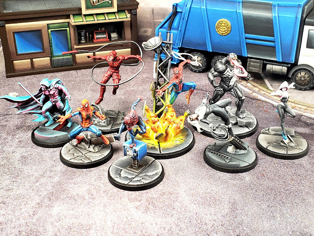
The red was also a bit of an experiment as I had just learned a painful lesson with Carnage and I wanted Spidey's red to be bright and vibrant. I ended up going with a bright yellow under coat and then painted a bright red wash over that and it is a night and day difference from how Carnage looks. However, I don't feel like it has the depth I'm going for, so I think in the future I'm going to try to go with the yellow under coat, bright red on top and then shade down into brown or violet to give the red depth. I think this will help to keep the red bright, while also giving it depth and hopefully finally give me a red I feel comfortable with and can rely on going forward.
Spider-Man (Miles Morales)

I am probably far more proud of this paint job than I should be. When I went into it I was worried about how to paint his black/blue and I was really worried about how to paint the red webbing pattern. I decided to pull from my experience painting Hawkeye and try to make his black into a really deep blue and yet still highlight all the way to white. I'm really thrilled with out it came out. I think technically it's supposed to be black and so if I were to repaint it I think I would try to stick with that by using only really dark blues for the highlighting. Despite my worries about the red, I feel I was able to keep it really clean and even get a lot of depth out of it. I also think I did a good job on the highlighting of the muscles, showing my experience working on past models was paying off. Overall it was a really rewarding experience and I love the way it looks on the tabletop.
Black Cat

Finished up Black Cat. She was pretty fun to paint. I think I'm finally at a point to where I'm comfortable painting black, which I never would've believed would be true at the beginning of this project. I've noticed since switching over to Scalecolor that I'm having to relearn how to paint certain colors. Before switching I had gotten rather comfortable with white and now without the benefit of GW Corax White, I feel a bit like a beginner when painting it again. Same is true with yellow and red, which I'll get into when I talk about Omega Red, which I'm working on now.
You might notice that she has some terrain in her background. This is largely because due to her color scheme being black and white and pale skin, I really struggled with pics of her as all the detail kept getting washed out, no matter what I did with my camera settings on my phone. It was a really big reminder that I need to get set up with a better (and permanent) photo taking setup. I'll have to dig into that later. The other thing I think I discovered with Black Cat is that I really struggle with faces and honestly I'm not sure what to do about it. I spent a proportionately large amount of time on her face just because I couldn't quite get where the mask and the eyes begin and even looking at her now I feel you can't really make out a lot of detail on the face. I'm not sure if my eyesight just isn't as good as I remember it being or if I'm just not used to looking at a model that closely or what, but my faces are definitely lacking and I think it really shows with Black Cat. I'm going to have to be more cognizant of that going forward.
Daredevil

Daredevil painted up extremely quickly and I am super happy with how he came out. It's a different red than I am used to working with and I'm glad I had the forethought to intentionally focus on that red instead of defaulting into one of my more comfortable red recipes. I don't think he would look as good with a more traditional red. Originally I was worried that him being so monochrome was going to make painting him boring or make the output look dull, but there's so much little detail in his mini that painting him was really fun and it gave me all kinds of little areas to play with that really give the model depth. I honestly have no idea how I would improve upon him at this point.
Ghost-Spider

I really struggled with this paintjob. I've become pretty comfortable with painting white, but with her I think it really didn't turn out well. Also I really struggled with the transitions on the black. Overall I just think she feels choppy and chalky. I'm not terribly invested in the character, so I don't see myself doing a repaint anytime soon, but she's definitely one that I think could benefit from it.
Moon Knight

Had to do some conversion work for Moon Knight. Didn't like the idea of the rooftop bit he's standing on being in the middle of the street, so I decided to convert it to look like he's standing on a rooftop. The conversion is far from perfect, but I feel like it gives off the general idea well enough.
As far as painting goes, he was an absolute blast to paint. I'm so glad I opted to go for a double OSL effect instead of just painting him white. I wanted to make it look like he's overlooking a city with neon lights in the middle of the night, so I decided to go with a cool blue moonlight lighting him up from above and a bold magenta lighting him from below. This has the added bonus or giving a pseudo synthwave look to it, which I dig. I added the OSL with an airbrush and used white and glazes to blend the airbrushing into the white and to do highlights. Overall I really like how it turned out, however I think it might've benefitted from my original zenithal being applied as both a zenithal and as a kind of reverse zenithal to aid with the pink lighting from the city. If I could do it again that's how I would go.
I think an important lesson I learned with him is that you really can continue painting a model indefinitely if you so desire. I lost count of how many times I looked at the model and thought: "Cool, he's done. Time to finish the base and take pics." and then moments later thought: "I feel like I should add a bit more to..." and continued working on transitions, highlights, OSL, etc. When I look at the model half of me thinks it looks really cool and that I'm really excited to put him on the table and the other half of me looks at how much smoother the transitions could be, how much higher I could take the highlights and it makes me realize I could've easily spent another dozen hours on this model. But it also makes realize that I don't need to. It makes me realize that at some point you have to just decide the model is "done" and no matter when you make that decision, it really is an arbitrary decision. It really is just personal preference. It really changes my perception as to what counts as a "good" paint job. Does it accomplish your purposes? Then it's good. Could it be better? That answer is ALWAYS yes. And it's irrelevant.
Spider-Man (Peter Parker)

So Spidey was one of the core set models and as such I think it's one of my sloppier paint jobs. That being said, my relative comfort with blue and red helped a lot and I think he's a very serviceable paint job. I debated going back and forth between painting all his web lines in the red of suit black or just leaving them a dark red by picking out the raised portions with highlighting. I'm still not certain I made the right choice here. I also think the red needs to be brought up more. I struggle with highlighting bright red. It often ends up either looking pink or looking orange and it always feels off to me. Perhaps when I do my core set repaint I can play with this on him and see if I can find a recipe/technique that finally "fixes" this issue for me.
Venom

So Venom is one of my all time favorite comic book characters. I love his aesthetic and character. The Maximum Carnage comic event really made me fall in love with the character. After painting the core set characters and feeling disastrously bad at doing black (I'm so sorry Black Widow and Red Skull. I promise I'll do you justice someday), I really didn't want to mess up Venom. After getting more practice in and feeling relatively successful with it when I did Black Panther, I decided to finally tackle Venom. I also think what I learned doing Hulk helped out greatly here as I learned a lot about what I liked and didn't like with highlighting muscles. I was really happy with how he came out, but now looking at him and in especially in the context of using dark blues to highlight black and seeing the muscles that could've been highlighted more logically, he's a model I'd really like to repaint.
On a funny note about him, the studio model has been painted incorrectly (or at least not according to "canon"). The body of the spider has been painted as if it is not a body, but rather legs. I noticed this when I went to paint mine and when I referenced the studio model something just didn't look right.


No comments:
Post a Comment