Cabal
The Cabal has been a really fun faction to paint. I will be doing repaints of the characters from the core set (Red Skull, Crossbones, Ultron and Baron Zemo) as I've come a long way as a painter since painting the core set and I think the those are far below what I can accomplish now. This faction, much like the Avengers, seem to have a nearly endless list of characters that get added to it, so I suspect I will never be done working on them.
Red Skull
So Red Skull, being one of the core characters, suffers from my original misguided attempts at batch painting and then drastically changing up my approach and going high contrast painting. He's also one of my first attempts, along with Black Widow, at painting a model that is mostly black. As such he is pretty muddied up, overdone on his highlights and sloppy in his transitions. I'm already working on a second core set to replace him, using everything I've learned since working on this project. I'm really looking forward to comparing the new version to this one to see how far I've come.
Red Skull - Repainted
Finished up my Red Skull repaint. He was a ton of fun to repaint. I got to try out a few paint recipe/techniques that I had really wanted to try ever since botching a bunch of black minis. Overall I'm very happy with how he came out. I go into a lot more depth about the repaint and show comparison pictures between the new and old Red Skulls on my "Repaints" page. There's also a blog post update about it you can check out if you are so inclined.
Sin
With Sin I decided to try my hand at highlighting red using whites instead of yellows. I've struggled getting reds bright because if I go with yellow the red ends up with an orange hue and I want to break away from that. So with Sin I decided to give it a go using the new Scalecolor paints. Overall I'm pretty happy with how the red turned out. It feels like a true red and still goes all the way to white with the highlights, so I guess that's a mission accomplished.
Also working on getting black highlighted up using a very dark blue with progressively more white mixed in with each layer and I think I'm getting better and better at that. I tried a new recipe for the Auburn hair and I'm not sure I'm happy with it. I think I'm running into an issue where sticking to only Scalecolor is limiting my palette too much. When I was picking out the colors to paint the hair with I wasn't entirely thrilled with my options. I think I might've been better off including some GW paints to fill out the palette. This was painted up as a "quick and dirty" since I'm not really attached to the character in any way, so I'm pretty satisfied with her paint job. It's serviceable.
Tragically, I was really proud of how the skin turned out, but the camera washed out all the highlights, even after I tried to correct for exposure and contrast, so you can't really see it in the photos. I might have to try to retake better photos during the day and see if they come out better.
Baron Mordo
I don't have a whole lot to say about Mordo. Not a character I'm very invested in or frankly interested in. Wanted to get him painted as part of my Convocation. I saw doing his staff as an opportunity to practice Gambit's NMM staff I plan on doing, so it received much more attention than the rest of him did. I've noticed that doing chrome NMM is much easier when you have explicit borders like flat panels to work with. When doing it on a cylindrical surface it's not nearly as straight forward. You don't have the same border to accentuate to drive home the reflective look. Not sure how I can adjust what I did to get a better NMM chrome look. I'll have to put some thought into this before I attempt Gambit's staff.
Outside of that he was a relatively quick and straight forward paint job. I suspect he's one of those models that when I look back on I'll see all the things I could've done differently.
Baron Zemo
Baron Zemo, being one of the core characters, suffers from my original misguided attempts at batch painting and then drastically changing up my approach and going high contrast painting. Looking at the model I realize now I never even finished his sword. I think I had intended to do a NMM on it and just stopped once everything else was painted. His purple is also really sloppy from the original contrast base coat. I think working with his white helped me to understand how to paint white better. It made me realize I can start with a pale gray like Corax White and shade into a more proper gray and highlight into a pure white and it looks white, but also looks like it has depth to it. That would be the foundation for which all my white in this project would be painted going forward.
Fortunately, despite my issues with him, I will be doing a repaint of him with my second core set.
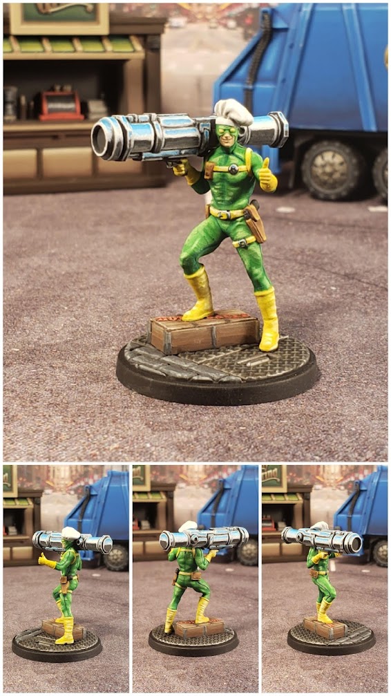
Bob, Agent of Hydra
Bob painted up pretty quickly and unsurprisingly I spent most of the time working on the NMM on the rocket. After chroming out my Omega Red, this felt like a cakewalk in comparison. Overall I'm pretty happy with him. The chrome feels very sloppy and that wasn't intended, but really I just used this as an opportunity to practice more chrome as I'm planning an Ultron repaint that will be almost entirely chrome and I definitely want to chrome out the tentacles on the Rivalry Doc Oc model that releases sometime this fall. Hopefully the more chances I get to do this the more I can make it smoother and more natural looking.
I don't really have much more commentary on him, honestly. I tried to go with a lighter green and overall I'm pretty happy with it. Oh wow, I just realized looking at the photo that I never added highlights to his holstered pistol. I'll have to correct that at some point. In the meantime I'm going to move on to projects I'm more excited about and call Bob done for now.
Bullseye
Bullseye was probably one of my fastest paint jobs and I'm really pleased with how he came out. After doing the dark blue on Hawkeyes pants I wanted to do a blue on Bullseye that wasn't as dark, but also wasn't really bright. I also wanted to take everything I had learned about highlighting muscles from painting Hulk and Venom and apply that to Bullseye. I'm absolutely thrilled with how he turned out and I have no idea what I would even try to do differently were I to repaint him. Total success in my book.
Cassandra Nova
Cassandra is a really, really niche character that I am not at all familiar with. I was not at all invested in her paint job and honestly saw it as an opportunity to test out an all Scalecolor recipe for leather, pale skin and khaki. Also, I moved to an area with much higher humidity and it's messing up my primer and I'm about to switch to an airbrush for priming my minis to get around this issue. Despite my best efforts Cassandra ended up with some "primer fuzz". Had this been almost any other character, I would've stripped the mini and started over until it wasn't an issue, but with her I decided to use it as an opportunity to work with the primer "defect" and see if I could make it work.
Overall I'm pretty happy with it. The camera washed out a lot of the highlights on the skin, but in person the effect looks very smooth and overall the mini looks nice. I think all the recipes I tested out work and will be a good basis for those things going forward. I was especially happy with the metal grating as this was my first time using Scalecolor for metallics and now I'm thoroughly convinced that Citadel's metallic paints are just awful and I should've stopped using them years ago. The Scalecolor ones work so much better.
Crossbones
So Crossbones is a bit of a mixed bag of success and failure for me. On one hand, he's one of the core models and got a thick base coat of contrast paints, which really hurt the overall paint job. On the other hand, playing with the white and the flesh tones worked really well and really helped me to understand how to paint those colors using the new high contrast technique I was using for this project. He also taught me that a number of MCP minis are not painted correctly as the studio painted Crossbones doesn't have the bar on the head painted white, which it is supposed to according to "canon". It's even sculpted into the model. This helped me correctly identify that AMG goofed on their Venom as well, so now whenever I see a mini I always do some googling to make sure I'm getting it right. At the end of the day it's just a personal preference and not really a big deal, but immersion is really important to me so I wanted to get it right.
Enchantress
I'm really proud of how Enchantress turned out. In particular, I'm really happy with her face. I think it's easily my best face so far. Faces are a major weakness in my painting, particularly due to the eyes which I honestly usually just avoid painting entirely (you may have noticed). However, when I was looking up how to paint Scarlet Witch I found a guide from Sorastro and in that guide he paints her eyes by first painting the whole eye area black and then painting flesh around it to clean it up and then painting white in the eye itself. I was really blown away by how good it looks. Now, it's possible that this trick won't work as well on male characters as the effect is intended to give an eye-shadow kind of look, but at least for Enchantress it works really well.
Outside of the face, I tried to make the green as varied as possible due to the monochromatic scheme of the character and I feel like I did a pretty good job. She feels varied enough to not be boring. I also feel like she's a good example of how I'm getting more comfortable with placing my highlights. Her skin, leg and hand highlights feel very natural to me. I think the only highlights I'm not really sold on are the torso highlights, particularly below the boobs. I think that's an area I still struggle with placing highlights on due to it's flat nature. Overall I think it's pretty passable though. Other than that, there isn't anything about her that I currently take issue with. I'm sure that'll change over time though.
Hood
Still unpainted/unreleased.
Killmonger
Killmonger was really, really fun to paint. I don't have much experience painting darker skin tones, so I was a little concerned about how I'd be able to pull that off, but I'm really happy with how it turned out. In restrospect I would probably change the highlighting on most of his muscles, but learning the appropriate way to highlight muscles has been a long learned lesson from this project and the process of painting him was one of the things that taught me that lesson.
Kingpin
Kingpin was a joy to paint and the process was really straight forward as I just followed Sorastro's video on him (subbing out paints for GW paints). I would not have had the foresight to shade the pants the way I did were it not for that video and I think that is a key component to making the model really look good. I'm thankful that I had enough experience painting white on other minis before I got to him, as painting so many giant white sections on a model would otherwise have been a really negative experience. Thank God for Corax White is all I can say. This is another model where when I look at it I don't really see anything I can improve on right now. I'm sure as my skill grows that'll change (hopefully), but as of this writing I think this is the best I can do.
Loki, God of Mischief
Loki was one of my early victories in this project. It was my first attempt at any decent amount of yellow and at a lighter green and was one of the first attempts at highlighting everything to white. I was really happy with how smoothly the yellow turned out and bringing everything to white worked really well. In retrospect I might have done more work on the orb in his staff, but generally speaking there's nothing I look at on Loki and think about how badly I want to redo it, which I've come to realize is my standard for being happy with my paintjob.
Magneto
Magneto was one of the models I was most excited to paint and one of my proudest paint jobs. I was home visiting family over the holidays and he was a Christmas present. So while painting him and I just got to sit back and get lost in the painting. I built his base and cape and kept his body separate during painting. I have enough experience with red and purple that I was pretty confident going into it, but from my experience with Hulk and Venom, I knew I need to pay close attention to where I highlighted his muscles. I feel like with him I finally found the right spots to highlight and there's really nothing about this model that I am unhappy with. The model was such a joy to paint.
Mister Sinister
Mister Sinister was an absolute joy to paint. I've always loved the character's aesthetic and I wanted to do his character justice. I knew I wanted to do a NMM style for his blue muscles and I knew I wanted to do a green OSL for the smoke. Unlike most of my minis I started with his base instead of saving it for last. I left his cape unglued to work on it separately. In retrospect I should've left his body not glued onto the cloning vat as it would've made working on the smoke easier.
As far as what I'm happy with, the blue I am pretty thrilled about. I think it really pops and really comes across the way the character is portrayed in the comics. I'm really happy with the black. I'm getting much more comfortable with highlighting it using the new recipe and it feels much more natural. I'm really happy with how the face came out. I was particularly worried about that going on.
I have mixed feelings about the red. I'm still struggling to find a way to highlight red that gives it that right brightness and has a lot of contrast, but doesn't go into pink/orange. With Mister Sinister I opted to avoid this entirely by keeping the highest red highlights a bright red. I justify this because with the contrast on the blue and the black with the green OSL, I don't think the red really needed to go that high. The exception I made was with the belt, which I wanted to match the highlight pattern of his muscles. I feel like I made a good call here.
I also have mixed feelings about the green. It's not as smooth as I would like it and in particular on the black and red it feels a little rough. In particular I tried creating a "glowing coil" effect the likes of which you see on plasma coils in 40k. It doesn't quite look right and I'm honestly not sure why. It's rather a shame as I'm really pleased with how the rest of the model came out and it would've been nice had that effect came through as I was intending. Altogether though I'm really happy with him and I think he looks great on the tabletop, so I'm marking him as a success.
M.O.D.O.K.
This is, without a doubt, the silliest model I've ever painted in my entire life. The character concept is so absurd and so over the top with cheese. He was also incredibly fun to paint and pretty much single handedly taught me how to paint yellow in a way that I am very, very happy with. To this day I'm amazed at how smoothly the yellow and the skin turned out. The only changes I would make are the purple, the red thing in his headband and the jet blast/smoke. What I learned from painting Green Goblin would greatly help with the smoke and I wish I had painted the red in the headband as if it were glowing, perhaps with some OSL. Outside of that, I will forever be grateful to this guy for teaching me to love painting yellow. Thanks M.O.D.O.K.
Mysterio

I had the benefit of a Sorastro guide for painting Mysterio, so he painted up pretty smoothly. He was a lot of fun to paint. I have a couple of critiques of him. One, my gold is not nearly as vibrant as Sorastro's and I think it's because I used less Sol Yellow when I was painting it. That's what I get for using the video loosely and not following the steps more carefully. The other main critique I have is I don't think I did a very good job on getting his bubble to look smooth. I tried to give it a swirly, cloudy mist look and I don't think it looks bad, but I do feel it looks too rough. In retrospect I think I should've spent some time wet blending it and really working on the helmet. It's such a critical component of the mini and obviously intended to be a focal point. I think since I was nearly done with him I got a little impatient and just tried to sprint the rest of the way to the finish line. I guess on the bright side I can always go back and just focus on the helmet. It's so isolated from the rest of the mini that I can play with it without compromising the rest of the model's paint job.
Mystique
Mystique was a real challenge for me. One of the first models where I was painting a huge amount of white and the blue was a very different shade of blue than what I was used to painting. I feel like she's a very serviceable paint job, but she's far from something I'm satisfied with. However, at this point, I'm not sure I could do a better job on her if I were to repaint her. This might be a model that years down the line I will look at and realize where I went wrong. Until then it'll have to do.
Omega Red
Man, where to begin with Omega Red. Everything about this model was an exploration and a risk. Since switching over to Scalecolor paints I am no longer comfortable painting red or yellow. I don't have a recipe down for either of those colors that I feel confident in. On top of that, I decided that I was going to try to do all his metal in chrome to 1.) challenge myself and 2.) because Omega Red has been a favorite character of mine for a long time. Prior to painting Omega Red, the model that held the crown for the model I've spent the most time painting was Thanos. Omega Red has officially taken that crown and honestly I think it'll be awhile until his throne gets challenged. I had to do him in steps and painted full other models in between those steps to prevent burn out. He's easily the most ambitious piece I've painted so far.
As far as how I feel about him; I'm generally thrilled. I think the chrome turned out so much better than I feared it would when I started. I think the coils are incredibly imperfect and there a millions of little missteps on them, but with how nuts it is to even try to chrome like 50 or so little trapezoidal metal panels (per coil), I'm more than willing to leave it alone and just take him in as a model and be fine with the imperfections. For my first attempt at highly reflective non-metallic metal, I really don't think I could've expected this good of a performance, let alone expected more. I'm really glad I challenged myself in this way if for no other reason than that it fully demystified painting chrome for me. I no longer find the idea of chroming Cable's gun or Deadpool's sword to be even remotely intimidating. Even tackling an Ultron repaint seems very doable now. Can't guarantee it'll look great, but I no longer see the idea as some insane feat that only a madman would attempt. It's weird because just typing that out and recognizing it is very empowering. That's pretty cool.
As far as the yellow goes, I'm pretty happy with the yellow recipe. I think it captures "dirty blonde" pretty well. I'm still not 100% on it, but I feel like I've got a better grasp on it than I did before going in, so it's progress.
As far as the red goes, it was almost as big a journey as the chrome was. In particular, I'm having a difficult time finding a level of highlighting and shading on red that doesn't make it look orange or pink. I seem to constantly struggle finding a way to highlight it all the way to white without over highlighting it and making it look atrocious. This is the same issue I run into with black (look at my first Punisher for an example of that). I tried watching several YouTube videos on this exact topic and everything I found didn't really tackle it. What I think I finally figured out with Omega Red was that just because I'm going all the way to white with my highlights doesn't mean everything that gets highlighted has to go all the way to white. It's okay to leave big panels at a brighter version of the base color and not have to get pure white in there somewhere. So when I went to do his highlights I used various red tones to highlight, but saved the very "pink" and "white" highlights for only certain small areas. Overall I feel like it works. I think especially since the model already has an insane amount of contrast thanks to the chrome, had I over-highlighted the red I think it might make the model very distracting and confused. This also makes me think that perhaps in the future when I do black, I should approach highlighting it from the same perspective and I might get similar results.
I feel like this challenge might've helped me grow as a painter more than anything I've ever done before. Feels like I smashed through a threshold with him. Very cool feeling.
Sabretooth
Sabretooth was unexpectedly one of the most fun models I've gotten to paint in this project. The sculpt is so clean and so detailed and everything about him just fell together. Granted, by the time I got to him I had found a recipe for yellow that I really liked, so that helped greatly, but overall he was just such a fun and rewarding model to paint.
Ultron
This is a model that I am frankly ashamed of. In the past I would've spent far more time drybrushing, washing and glazing to get this looking far better than it does, but at the time I was painting him I was just done and wanted to be done with it. In fairness to me, the photo really dims down a lot of the detail. I'm still struggling pretty greatly with taking good pictures of minis, but even accounting for that, he was always well below what I could have done. Since I've finished him I have seen Sorastro's video doing NMM on the entire model (what a madman). I will be attempting Ultron again and I will be trying to use Sorastro's video when doing so, so hopefully I can retire this version with something that looks remotely like I tried.
Viper
Viper was actually really fun to paint. Playing with the greens and trying to make her outfit look busy to prevent the monochromatic color scheme from bringing it down was actually quite fun. I also tried to use a different recipe for her flesh as I wanted it to feel pale and sickly and I'm really happy with how it turned out. I also tried a slight NMM effect on her sword and although it didn't come out like I was intending, I like the look of it. I think with the pistol I kind of took the lazy way out. I think I've realized that weapons are another one of my weakness as I'm never sure if I should make them look metallic, chome, black or what and I often end up making them look like some over-highlighted black blob. I think Cable's gun really suffers from that and I think Viper's does too. That's something I'll have to put some though into for future projects. Overall I'm pretty happy with Viper though. For now at least.


No comments:
Post a Comment