A-Force

I can't believe I'm finally finished with this team. At least for the time being. Lots of mixed feelings on the models in this faction. Some I see as really cool successes and others I kind of cringe when I look at. They really encompass the full range of this project at this point.
She-Hulk
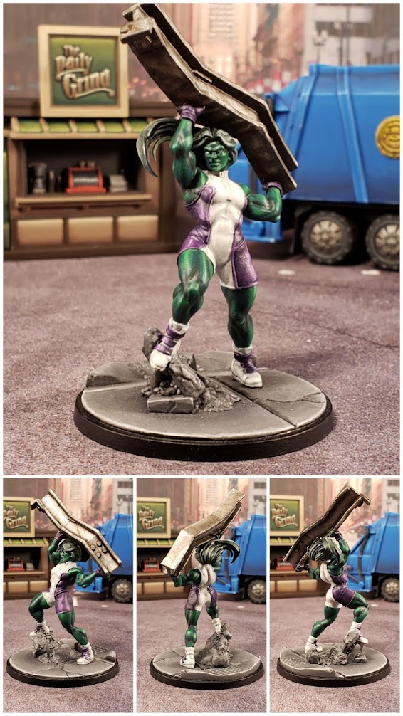
With She-Hulk I wanted to try something different with her skin. I saw her "canon" skin tone was a much lighter green, but I wanted to try going with a deep green. After playing with it quite a bit I ended up pulling off what I feel is a pretty cool deep green. Overall I think it was a good experience and helped me understand how to do darker colors effectively, but I don't think it looks very good on her model. Honestly I probably should've gone with the "canon" skin tone. Oh well, it was a fun experience either way and I think I learned something.
Angela

Took me way to long to get around to painting Angela, especially considering how good she apparently is in the game. I might have to return to rewrite this write up for her as right now I'm not sure how much insight I have as to her paint job at the moment.
I returned to my Thanos recipe for her gold and I'm glad I did, as I'm gearing up to paint Hulkbuster and I think this gold looks better than what I did on my Iron Man repaint. I continued with my lazy man's NMM for the all of the steel-esque metallics, which honestly looks too much like black and doesn't feel at all like NMM, even though it technically is. I think I'm going to have to tackle that at some point, but I'm not sure when. I think the problem with my "lazy man's" version is that it doesn't have any sky or earth in the reflection and so it just looks like detailed black instead of any kind of metallic, which looks especially off on Angela when you contrast it with her ribbons, which are essentially painted the same.
I'm pretty happy with how the flesh turned out and I think overall the flesh and gold look really nice. I'm far less happy with the hair, which I think I kind of got lazy about and probably should've taken it higher and I think I should've started higher on the white so it look less like a light grey. Overall though, I think the piece looks good and I'm generally happy with it. With her done I'm finally done with A-Force and Guardians of the Galaxy, at the time of writing anyway.
Black Cat

Finished up Black Cat. She was pretty fun to paint. I think I'm finally at a point to where I'm comfortable painting black, which I never would've believed would be true at the beginning of this project. I've noticed since switching over to Scalecolor that I'm having to relearn how to paint certain colors. Before switching I had gotten rather comfortable with white and now without the benefit of GW Corax White, I feel a bit like a beginner when painting it again. Same is true with yellow and red, which I'll get into when I talk about Omega Red, which I'm working on now.
You might notice that she has some terrain in her background. This is largely because due to her color scheme being black and white and pale skin, I really struggled with pics of her as all the detail kept getting washed out, no matter what I did with my camera settings on my phone. It was a really big reminder that I need to get set up with a better (and permanent) photo taking setup. I'll have to dig into that later. The other thing I think I discovered with Black Cat is that I really struggle with faces and honestly I'm not sure what to do about it. I spent a proportionately large amount of time on her face just because I couldn't quite get where the mask and the eyes begin and even looking at her now I feel you can't really make out a lot of detail on the face. I'm not sure if my eyesight just isn't as good as I remember it being or if I'm just not used to looking at a model that closely or what, but my faces are definitely lacking and I think it really shows with Black Cat. I'm going to have to be more cognizant of that going forward.
Black Widow
If there is any model I cringe at every time I look at them, it is this model. This model was a victim of being one of my first in this project and my first attempt at painting a mostly black model. My aims for this project were very different when I first started and drastically shifted as I was painting the core set models. That transformation mainly happened because of my experience painting Cap, so I'll go into that detail when I talk about him, but long story short, I started Black Widow by slobbering GW contrast paints onto her as a basecoat and then decided I wanted to paint everything in high contrast style, highlighting to white and shading to either pure black or near it and Black Widow being my trial run at doing this with black really didn't help. I've already purchased another core set and she will definitely be one of the models that gets a repaint. I want to prioritize new models first though, so it might be a while.
Black Widow, Agent of S.H.I.E.L.D.

Painting Black Widow 2.0 was a weird experience because it was like a mirror universe version of the experience of painting Core Widow. Painting Core Widow was a frustrating and painful experience because it was my first time trying to do a high contrast paint job on a predominately black miniature and it was horrible. I had no idea how to highlight black and it really shows. This time having the experience of painting black so many more times and getting a good feel for how to do it dare I say "well", this went very smoothly and felt really good the whole time.
I'm overall very happy with how she turned out and I'm more upset with my inability to take good pictures of black miniatures than I am anything about her paint job. The only real painting critique I have of her right now is I don't think the NMM of the gauntlets look right. It's such a small area to work with that I'm not sure what I would do differently, but something about it looks off. I suspect it's the top of the gauntlets and how they just reflect the sky and so you don't really get the ground/sky effect.
Captain Marvel

To be completely honest. I do not care for this character, so I was expecting it to be a chore to paint. I could not have been more wrong. It is such a nice sculpt and was really fun to paint. I think my comfort with painting red and blue really helped with that. Although, I've since seen Sorastro's guide on her and when I do my core set repaint I'm definitely going to play with glowing fists and OSL. Really looking forward to the repaint, to be honest.
Crystal

Crystal was quite the challenge to paint. I assembled her on her rocks and painted her and the rocks separately from the water and the base. In retrospect I should've put her rocks on her base and painted her separately from everything else. I painter her at the same time I painted several other minis for this project. I was trying to finish up a number of backlog minis that I wasn't really that into to get them done so I can move on to models I'm more excited about painting. However, of those models, she was the one I was actually excited to paint. I played around with different blues than I normally use as I wanted the water to have a brighter feel. For the OSL from the fire I used a thinned down Iyanden Yellow GW contrast. For it being such a quick paintjob (I think I spent maybe 3 hours on her total), I'm really happy with how it came out. It's a very fun model to paint.
Domino

Domino was painted right after I finished Cable and she is entirely done with Scalecolor paints. I didn't realize until I had finished her and Deadpool that I used Navy Blue as a base instead of Abyssal Blue, which I think makes the black look much more gray than it otherwise would (it's mixed with black). That being said, I really like how she came out. Due to how important the explosion at her base is to the model, I wasn't really satisfied with the explosion effect and OSL I used for Cable on her, so I experimented with some Inktensity (Scalecolor inks) using red and yellow and I think it really paid off. The explosion at her feet really look to me like an explosion and I think it really elevates the model.
As I've said with both my Cable and Deapool comments, my one criticism of Scalecolor is that their whites seem a little muted and I feel like the model doesn't quite "pop" despite having been taken all the way to white. I think in the future I'll use another brand's white to get that effect back. Luckily (fitting for Domino), I'll have a second version of her to paint as I'm getting a second Cable to paint up in X-Force colors, so I'll get a chance to make all these changes on my second go-through with her.
Now that I've had a chance to do a few models using dark blues with whites mixed in for highlights for my blacks I think I really like how it looks. It feels much more natural and doesn't look as "chalky". Makes me really excited to paint up a new Venom.
Gamora

Weirdly enough, despite the Guardians of the Galaxy movies being among my favorite of the MCU films, for some reason I just am not that into them in MCP. I have no idea why. Gamora was weird to paint because I'm not at all familiar with her comic version, which is what the model is based on. She was quite the challenge to paint because she's very monochromatic. Now that I've worked with using blues in highlighting black instead of grays I think I couldn't done this model more justice, but overall I'm happy with how she turned out. Thanks to Corax White (the base paint, not the primer), painting all the white on her was actually rather painless and she painted up fairly quickly.
Medusa

This was probably the Inhuman I was the least excited to paint and the Inhuman I had the most fun painting. I assembled her body and kept it separate from her hair, save for gluing her face onto her hair (it fits onto her hair much easier than onto her body). This really allowed me to play with the tones on her hair. I had fun drybrushing, glazing and washing to my hearts content until the hair felt very full and detailed and varied. The only "hard" part was reminding myself when painting the body that I had to account for where her hair would be blocking the light. Really fun model to paint. Highly recommend. Don't glue her body in before you paint her.
Okoye

Okoye was one of a number of minis I batch painted because I wanted to be done with them. In retrospect I don't want to do that anymore because I think all the models I do that to don't get fully highlighted up to white as I'm in too much of a hurry and they just don't "pop" as much as the others do. I'm also think she could have benefitted from some NMM play and that's just not something you're going to take the time to do when batch painting. Honestly she's a bit of a missed opportunity in my eyes, but there are so many other models I'm much more excited to get to, so I'm not really going to sweat it.
Scarlet Witch

I used Sorastro's pdf guide to paint Scarlet Witch and I'm very glad I did. Before deciding on his guide I went back and forth a few times on how to go about painting her and as a result she ended up with a couple of base coats on her, so I think her detail could be better. Also, I really wish I hadn't glued her to her magic effects before painting her.
The magic was annoying to paint, but I think the effect works really well and I really like how striking it is. It was achieved using "Brilli White" from Scalecolor over a white base coat and then painting Vallejo's Magenta Ink over that. The funny part is I think I didn't go very bright with her reds and pinks and I think that would've brought the model down, but the brightness of the magic really brings it together.
Speaking of brightness, I'm really struggling with white on Scalecolor and I think it's really obvious with Scarlet Witch. If I use the Scalecolor brand of white the blends are really smooth, but the white is very muted and I don't get that "pop" effect I'm looking for. Sorastro often uses Titanium White from PrimAcryl, which is a very powerful and bright white, which is great, but it doesn't blend in with the Scalecolor paints the way the Scalecolor brand white does, so I get the "pop" effect, but the blend kinda goes to crap. I've been really struggling with that and I'm still not sure what to do about it.
I'm really thankful to my wife on this one, who as politely and gently to me as possible, suggested that I should go up higher on the highlights on her face. I can be rather sensitive to criticism when I've just finished a mini and I'm in the mood to celebrate being done with it and my wife is an angel for weathering that storm and still helping me to improve by challenging me even when it's hard to do. Had she not given me that advice I don't think I'd have come up on her face and I think doing so really helped the model look a lot better.
With Scarlet Witch done my Defenders are complete (for now). I've only got another 10 models to go to be done with my backlog and with the news of indefinite delays on international shipping it loos like it's gonna be awhile until I get any new releases, so I really have no excuse for not finishing my backlog. Should probably be able to finish a bunch of terrain too.
Shuri

Shuri was one of a number of minis I batch painted because I wanted to be done with them. In retrospect I don't want to do that anymore because I think all the models I do that to don't get fully highlighted up to white as I'm in too much of a hurry and they just don't "pop" as much as the others do. Honestly I don't have a lot to say about her because my process with her was very rushed.
Storm

Storm has been sitting on my paint desk for a very long time. I don’t think I’ve been more intimidated about painting a model as I have been with Storm and it’s caused me to put off her paint job in favor of less intimidating models for quite some time. I’ve seen so many paint jobs on her where the light from the lightning is entirely (or almost entirely) ignored and I really wanted to avoid that. I really liked the idea of virtually all of the light coming from the lightning, to really show how powerful the lightning strike is and be a nice focal point for the paint job. I also liked the idea of having a powerful glow come from her eyes.
I recently learned with Blade that doing the OSL via airbrush before painting the model doesn’t work. I ended up having to redo the OSL by hand afterwards and I think the model suffered for it. In retrospect I should’ve just airbrushed red on him after painting him and then touched it up with a brush to make the OSL clean. So with Storm I decided to try that. After giving her a general prime I used airbrush white to lay out the areas that were going to be lit up from the lightning strike.
I then laid down base coats for her skin, outfit and hair. I then re-established the OSL using very light white spray from an airbrush. I then picked out the highest highlight colors and watered them down to turn them into a glaze and worked the OSL into the base coats. I played with this step for some time, trying to make the transitions smooth and all the while trying to remember to keep the highlights going in the direction of what would be lit up from the lightning.
After doing that I noticed that the black on her outfit in particular just didn’t look finished. The problem here is that all of the lighting is coming from either beneath her or behind her, so the darkest area on her is the front of her torso. However, just leaving it black was making it look unfinished, which is no good. The fix I came up with for this is to highlight up the darkest areas with just a layer or two of highlight, keeping them a very dark bluish grey, to give them some depth. If I kept this minimal, in theory it should give the black depth without taking away from the OSL.
Finally I struggled with what to do with the lightning itself. I’ve seen it painted blue, yellow and white and of those I liked blue the most, but having the OSL from the lightning being blue didn’t seem right to me, so I opted to try to keep the lightning on the lighter end of blue and keep the OSL white. I’m still not sold that this was the right decision, but I feel like the piece looks good enough that I should just call it.
Overall I have no idea how I feel about the paint job. Everything with it was so experimental and the results are so mixed that I’m just not sure if the decisions I made on how to achieve what I was going for were the right decisions. It will be interesting to go back and review this mini once I’ve had more time to sit with my feelings about it and perhaps after I’ve had more practice with similar techniques.
Valkyrie

Valkyrie was one of a number of minis I batch painted because I wanted to be done with them. In retrospect I don't want to do that anymore because I think all the models I do that to don't get fully highlighted up to white as I'm in too much of a hurry and they just don't "pop" as much as the others do. I'm generally happy with how her cape turned out, but I wonder if it would have benefitted from using dark blues for the highlights instead of a grayscale. I liked getting to practice on leather with her as I haven't had much chance to do that with this project.
Wasp

Wasp was quite the project. I knew right off the bat that I didn't care for the rebar piece that the mini version of her comes on and hence I knew I wanted to replace it. It was my wife's idea to replace it with a die. I originally was very skeptical of this, but as is often the case with my wife, her ideas might sound nutty at first, but that's just because they are brilliant and I haven't figured it out yet. Once I had posted the mini to reddit I had people recommend I put a small die on the base of the regular version of her to tie them together. I thought this was a great idea and so I found the smallest die I could. It's not perfect from a scale perspective, but I really like it.
From a painting perspective, Wasp really benefitted from my experience working on muscles and you can see it in the characters legs and butt. The highlights are where the light should be hitting and not highlighted like a flat panel from top to bottom. This project has also really benefitted from my newfound comfort with painting yellow (thanks M.O.D.O.K.) and I think it shows on her as well.
The wings were an odd thing to paint because I knew I wanted them to remain transparent, but I wanted them to have an insect-y shimmer. So I painted her without her wings and painted the wings separately. For the wings I spent quite some time trying to find guides on painting insect wings or transparent shimmer effects and nothing I found touched on painting over clear plastic, so in the end I just opted for using contrast paints as glazes and tried to mix together some blues and purples. Overall I think it turned out alright, but it's easily one of areas that could be most improved.
The die was also an interesting thing to paint. Originally I wasn't planning on painting it, but the process of pinning the model to the die and fixing the die to the base made it necessary. Painting big white panels was rather intimidating, but I think the practice of shading the panels really helped with getting an understanding of how to paint white and how to work on transitions. I'm pretty happy with how the die turned out.


No comments:
Post a Comment