Midnight Sons

Blade
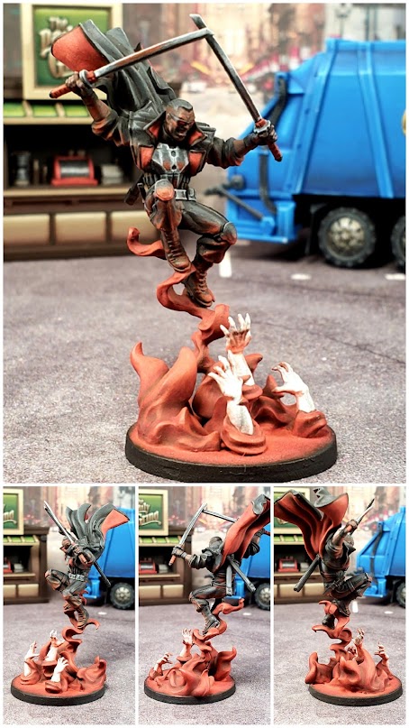
For the modelling, I really dislike that the vampire hands come out of concrete as I think it looks silly and ruins my immersion, so I wanted to change that. I wasn't quite sure how I was going to go about fixing that as I think the vampire hands themselves are really cool and it creates a very iconic pose from a comic cover and I wanted to retain that. What I ultimately ended up doing was sanding down the concrete off of a regular flat base and using liquid green stuff to try to smooth out the top and get rid of any gradient so that I could attempt to just make the base look like darkness with smoke/blood magic/whatever coming out of it. I also had just gotten in my Dormammu and I ended up with extra bits of flame that I felt worked fairly well as just more smoke so the base would be less empty. Overall I think this part of it turned out really well.
The color choice is another matter entirely. Originally I was leaning towards either a purple or a green for the smoke/magic/whatever with the vampire hands coming out of it. My wife suggested doing it in red, what with the vampire theme and all. I decided that made sense and went for it. My only real issue here is it feels very, very monochromatic and I'm not sure I care for it. I suspect I would've been happier with purple to break up the model more. However, he is Blade and he is a vampire hunting other vampires, so it does feel very "in theme", so I'm not going to sweat this too much. I do have a second copy coming as a Christmas present from a friend, so I might try another version with a different color for the smoke and see how that works.
As far as the painting process itself, I have very mixed feelings. Black is becoming more comfortable for me to paint and I'm pretty happy with how that turned out on him. I feel like I'm getting a lot better at highlighting things naturally and getting away from my habit of treating everything as a panel and shading from one end to the next. The NMM on his swords also felt more comfortable, but I almost feel like you have to throw in a light blue for NMM steel to really look right, which I think it unfortunate as it doesn't fit here, so I didn't do it. Thus, something about his swords doesn't feel "right" to me and other than adding a light blue, I'm not sure what to do about it. Finally the OSL was something I was really anxious about. I was really worried it would mess up the paint job and I can't really tell if I dislike the actual OSL or if I just don't care for the monochromatic nature of red as a color choice for the OSL on this model. It feels a bit heavy handed and part of me wonders if I'm rushing my point jobs because I'm trying to finish my backlog.
Overall I think he looks much better than what I could've accomplished a couple years ago and the fact that I look at him and see lots of things I wish I had done differently proves that I'm really pushing myself as a painter, so I guess I should put that in the win column. At any rate, I'm actually really excited to play Midnight Sons and now I'm only one painted model away from having the full faction painted, so I'm really excited about that.

Finished up Black Cat. She was pretty fun to paint. I think I'm finally at a point to where I'm comfortable painting black, which I never would've believed would be true at the beginning of this project. I've noticed since switching over to Scalecolor that I'm having to relearn how to paint certain colors. Before switching I had gotten rather comfortable with white and now without the benefit of GW Corax White, I feel a bit like a beginner when painting it again. Same is true with yellow and red, which I'll get into when I talk about Omega Red, which I'm working on now.


Had to do some conversion work for Moon Knight. Didn't like the idea of the rooftop bit he's standing on being in the middle of the street, so I decided to convert it to look like he's standing on a rooftop. The conversion is far from perfect, but I feel like it gives off the general idea well enough.
Black Cat
You might notice that she has some terrain in her background. This is largely because due to her color scheme being black and white and pale skin, I really struggled with pics of her as all the detail kept getting washed out, no matter what I did with my camera settings on my phone. It was a really big reminder that I need to get set up with a better (and permanent) photo taking setup. I'll have to dig into that later. The other thing I think I discovered with Black Cat is that I really struggle with faces and honestly I'm not sure what to do about it. I spent a proportionately large amount of time on her face just because I couldn't quite get where the mask and the eyes begin and even looking at her now I feel you can't really make out a lot of detail on the face. I'm not sure if my eyesight just isn't as good as I remember it being or if I'm just not used to looking at a model that closely or what, but my faces are definitely lacking and I think it really shows with Black Cat. I'm going to have to be more cognizant of that going forward.
Doctor Strange
The job I did on Doctor Strange is a mixed bag for me. I struggled with the red as I wanted to bring it up in highlight more, but I didn't want it to turn pink. This struggle has been an ongoing part of this project. I'm happy with my deep reds, but I've never really been happy with highlighting my brighter ones. I eventually opted for using oranges/yellows for the highlighting and I think it really helped. Overall I'm really happy with how the red turned out, so I see that as a victory. That being said, I kind of feel like the rest of the mini is a miss. The highlighting on the blue doesn't feel natural to me. I think the gold on the rings was a mistake. I think I should've opted for another color and used OSL effects. I painted this before Sorastro came out with his video on it and I really wish I would've had that as a resource before I painted mine. Now that I think about it, I think he is a good candidate for a repaint, especially since I feel similarly about Wong. Perhaps I'll look into picking up another box.
Doctor Voodoo
Still unpainted and/or unreleased.Ghost Rider
I could practically write an entire blog about this one model. I don't think I've put more thought or time into any other model. When I first started him I started with the wheel flames and my wife made a joke comment about them looking like roasted marshmallows. She was right. The flames were predominately white and when through yellow to orange to brown and the transition from yellow to brown was fairly quick. The flames were also only on the tires and the tires themselves were still black. They didn't look bad, but they didn't look like Hellfire. Something felt like it was missing, but I couldn't figure out what.
I went to discord and reddit with progress pics and asked people for advice and honestly most of the advice I got wasn't terribly helpful. However, one person showed an image of theirs and they had painted the entire wheel aflame and I thought that looked so much better. I also realized that the comic version is often depicted with the wheels entirely aflame instead of just on fire. Another person posted a guide on painting Legion of the Damned for 40k by a professional painter on YouTube (I think it was Sam Lens). Watching that video made me realize that to get the Hellfire look, I need to go more with oranges and yellows and save the white for the recesses of the flame. It also made me realize that going to brown was a mistake as it gives a burnt look and makes the fire look less hot.
At this point I stripped the roasted marshmallow paint job, reprimed and started again. I immediately was much happier with the paintjob. It was looking pretty great. However, this led to the next dilemma. I wanted to do a sort of NMM on at least the pipes of the bike if not the bike itself and at this point I hadn't realized that using dark blues for highlighting black is better, so I had to figure out how to paint all the black and the OSL on the black. Everything about this was intimidating to me.
For the "NMM" (if you can even call it that on this model), I just used my typical grayscale. In retrospect I should've included some blue for sky reflection to really sell the NMM effect. This is another model that I didn't have the luxury of relying on a Sorastro video and then got to see what Sorastro did with it after the fact. In this case it was a bit of a mixed bag because I think the NMM that Sorastro does would've looked much better than what I did and his way of highlighting the black looks so much better than what I did, but he painted the wheels like normal wheels with fire coming off of them and I think the wheel entirely aflame looks so much better.
Were I to repaint him, I'd follow Sorastro's guide to get the NMM and black highlighting and use my previous experience to get the wheels the way they are now.
Overall I'm really happy with this model. It was the most challenging paint job I've ever attempted and I think I grew more as a painter from this model than I have from any other model I've painted. It was a great experience. Every aspect of the model was outside of my comfort zone and now that I've tackled that it's made me more likely to take on projects and techniques that otherwise intimidate me.
Iron Fist
I finished up Iron Fist just in time for a tournament. He was a far more intimidating model to paint in my mind then he was to actually paint. Once I got into painting him the work just kind of flowed and it was really fun. I'm not sure of how much I should equate this to the fact that I painted him entirely with Scale color paints. They flow so nicely and blend into each other so well that things that are normally difficult to paint, like pale flesh and fire, just kind of came together. I've noticed that I spend far less time when using Scale color analyzing my blends and trying to figure out how to "fix" them to blend together better. I've noticed that when I add a layer with them and it dries it looks almost like I wet blended, which is really surreal. They're quickly turning me into a Scale color salesman.
However, I also just got done doing explosions on Domino and Cable and working with flame effects on models like Ghost Rider, so a lot of this might be due to my being much more comfortable with painting those things. I think being in a hurry to get him done for a tournament actually helped me, because I already knew how I wanted to paint him and had experience with each of the things involved in painting him (flesh, osl, etc.) and had I just sat around looking at him with no "hurry up and get him done, you don't have a day left" mentality to push me into it, I think I would've agonized too much over how to paint him.
Moon Knight

As far as painting goes, he was an absolute blast to paint. I'm so glad I opted to go for a double OSL effect instead of just painting him white. I wanted to make it look like he's overlooking a city with neon lights in the middle of the night, so I decided to go with a cool blue moonlight lighting him up from above and a bold magenta lighting him from below. This has the added bonus or giving a pseudo synthwave look to it, which I dig. I added the OSL with an airbrush and used white and glazes to blend the airbrushing into the white and to do highlights. Overall I really like how it turned out, however I think it might've benefitted from my original zenithal being applied as both a zenithal and as a kind of reverse zenithal to aid with the pink lighting from the city. If I could do it again that's how I would go.
I think an important lesson I learned with him is that you really can continue painting a model indefinitely if you so desire. I lost count of how many times I looked at the model and thought: "Cool, he's done. Time to finish the base and take pics." and then moments later thought: "I feel like I should add a bit more to..." and continued working on transitions, highlights, OSL, etc. When I look at the model half of me thinks it looks really cool and that I'm really excited to put him on the table and the other half of me looks at how much smoother the transitions could be, how much higher I could take the highlights and it makes me realize I could've easily spent another dozen hours on this model. But it also makes realize that I don't need to. It makes me realize that at some point you have to just decide the model is "done" and no matter when you make that decision, it really is an arbitrary decision. It really is just personal preference. It really changes my perception as to what counts as a "good" paint job. Does it accomplish your purposes? Then it's good. Could it be better? That answer is ALWAYS yes. And it's irrelevant.

Wong
Wong is one of several minis I painted in an assembly line to get them knocked out so I could move onto other minis. Going forward I'm going to try to avoid doing that as I think it lowers the quality of the paint jobs too much. Wong is a good example of that. All of things that are highlighted didn't quite go all the way to white and had I been painting him by himself I would've spent more time on transitions. Overall I'm pretty happy with how it turned out. I think in retrospect I should've done an OSL for the purple energy and maybe even have reversed the highlighting to make it look like there's some kind of heat emanating from within the smoke. He wasn't a huge priority for me as a mini, so I'm okay with him as he is, but there's plenty of room for improvement.


No comments:
Post a Comment