Sunday, February 27, 2022

Honey Badger & X-23

 Honey Badger & X-23


One of the things that's really rewarding about this hobby is that moment you're working on a project and realize that most of what you're doing that is routine and easy and you're just casually knocking out used to be a dilemma that you would agonize over how to go about accomplishing or struggle to actually do due to having no idea how to do it effectively. After having tackled black, white, yellow, skin and female faces so many times in this project, I am no longer intimidated by painting them and it has become routine. Painting X-23 and Honey Badger really drove that point home as they were both just quick, fun, simple paint jobs that I didn't stress over, didn't worry about and I'm really happy with the end result. Mind you, I don't think they are award-winning worthy paint jobs or anything, but they are very serviceable paint jobs that I was able to do relatively quickly.


The only thing that was in any way intimidating about painting Honey Badger is just how insanely small the model is. It almost felt like I was painting a smaller scale model than MCP minis, which I haven't done in some time, so that was kind of weird. However, knowing how small the model was also made me stress less about how well details translated, so maybe that was more of what added to the ease than subtracted from it. It's hard to say.


At this point I'm so practiced with yellow, black and white that I kind of turned my brain off and just laid down the recipes I've come to rely on. It was very relaxing and fun. I spent more time worrying about staying inside the lines of where is supposed to be what color than I did worry about things like transitions or color choices. Honestly, that's probably where you'll find the most mistakes on her, especially when laying down those red lines as I'm certain I slipped up and just said "eh, oh well" instead of clean up the mistake several times.


When painting her my mind kept going back to the lesson I learned from Sorastro in some interview he did where he said that one of the biggest problems he sees with new painters is that they feel compelled to highlight every edge and that doing that takes away from making the model look naturally lit and that just because an edge is there, doesn't mean it needs or should be highlighted. I think that's one of the best pieces of painting wisdom I've ever picked up as it not only allows me to paint models that look better, but it actually makes the painting process go faster as the areas for instance under her arms and on the bottom/inside of her legs you can just hit up with a darker or base color and just leave it alone.
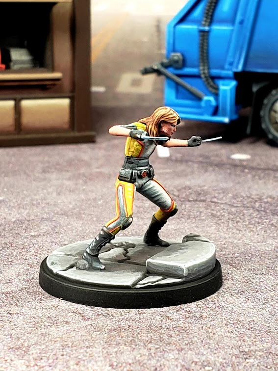

Then you can spend more time highlighting up the areas that you actually see when looking at the model and putting more effort into those, which means you're getting more efficiency out of your paint jobs and spending more time working on the stuff that makes the model look better, which at least for me is much more fun that putting down base coats of highlighting some piece of a model that is hard to see, which means you enjoy painting more and hence it's easier to motivate yourself to do it. You end up enjoying the painting process more, painting quicker and more effectively and getting better looking models when you're done. Wish I wouldn't gotten that advice a couple of decades ago. Who knows how much better of a painter I'd be by now.


Honey Badger ironically is one of the better faces I've painted. I say ironically because she's the tiniest model in MCP by a mile and the amount of detail I got into the face honestly impresses me. You would think it would be easier to get this detail into the bigger faces, but apparently I'm a paradox on that topic.


On the topic of where to place highlights, X-23 was a bit of a weird challenge because the front of her model is facing down, but her torso is twisted, so it's not obvious what needs highlights and what doesn't, especially on the front of her torso. Fortunately, she's all blacks, greys and whites and has big claws that can get a NMM effect with some sky reflection, so there are a lot of areas you can focus the light to take away from the lack of highlights on places like her stomach, which realistically shouldn't go up in highlight very much.


One of the bigger challenges when painting her was actually the build of the model itself. her connection of her foot to the rock is not the most stable connection one could hope for and at several points it started to break and after trying to stabilize it with glue two or three times, I eventually just pinned it. Probably should've done that to begin with.


I feel like this is a model I'm going to be harder and harder on myself the more I look at it. The monochromatic nature of it really lends itself to focusing on details instead of how the model hits you, so I feel like the more I look at it the more I am going to criticize the transitions and the highlight placement. Part of that is the photos though. I don't know what it is about greyscale, but whenever I take photos of it it makes my transitions look awful and the highest highlights always get washed out. The model is always more pleasing to the eye in person than it is in the photos whenever it's color scheme is predominately greyscale.
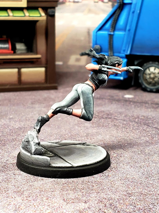

I'm also still struggling with NMM on tiny surfaces. I tried to fit a sky reflection into the blades, but I didn't bother trying to do a sky/earth split as I don't feel like there's enough surface area to make that happen. I'm not positive how well it comes across. In person the claws do look metallic and contrast quite well with her greyscale outfit, so I suppose I should chalk it up to a win, but I can't shake the feeling that there's something I could've done differently that would've worked better. I just haven't the slightest what that is.


So X-23 is historic for me as she is officially the first model I've bothered to try to do pupils on. My philosophy on eyes has always been that doing the details on them is mostly unnecessary because realistically you don't see the details on someone's eyes until you are rather close to them and with the scale of the models, it wouldn't make sense that you can see the details in their eyes. In fact, to get this picture I had to get really, really close to the model and for tabletop purposes it's entirely unnecessary.

However, I learned with Enchantress that if you lay down some black for eye shadow, clean up the edges with flesh, then put in a white dot, it gives a really good impression of an eye, so for female characters I started doing that. However, with Enchantress it makes sense to not have a pupil because her eyes can be argued to be glowing when she's doing magicky stuff. With X-23 that doesn't make any sense and my wife pointed this out (very politely). I then realized that leaving her eyes like that does indeed make it look like her eyes are glowing as soon as you get close enough to the model to see the white, so I decided to break my rule and try to paint pupils. Honestly considering it's my first attempt I'm pretty happy with it. Not perfect (especially on her left eye), but overall not bad. Hopefully this doesn't start a trend of me doing this with other models.

Sunday, January 16, 2022

Storm

 Storm


Storm has been sitting on my paint desk for a very long time. I don’t think I’ve been more intimidated about painting a model as I have been with Storm and it’s caused me to put off her paint job in favor of less intimidating models for quite some time. I’ve seen so many paint jobs on her where the light from the lightning is entirely (or almost entirely) ignored and I really wanted to avoid that. I really liked the idea of virtually all of the light coming from the lightning, to really show how powerful the lightning strike is and be a nice focal point for the paint job. I also liked the idea of having a powerful glow come from her eyes.

I recently learned with Blade that doing the OSL via airbrush before painting the model doesn’t work. I ended up having to redo the OSL by hand afterwards and I think the model suffered for it. In retrospect I should’ve just airbrushed red on him after painting him and then touched it up with a brush to make the OSL clean. So with Storm I decided to try that. After giving her a general prime I used airbrush white to lay out the areas that were going to be lit up from the lightning strike.

I then laid down base coats for her skin, outfit and hair. I then re-established the OSL using very light white spray from an airbrush. I then picked out the highest highlight colors and watered them down to turn them into a glaze and worked the OSL into the base coats. I played with this step for some time, trying to make the transitions smooth and all the while trying to remember to keep the highlights going in the direction of what would be lit up from the lightning.

After doing that I noticed that the black on her outfit in particular just didn’t look finished. The problem here is that all of the lighting is coming from either beneath her or behind her, so the darkest area on her is the front of her torso. However, just leaving it black was making it look unfinished, which is no good. The fix I came up with for this is to highlight up the darkest areas with just a layer or two of highlight, keeping them a very dark bluish grey, to give them some depth. If I kept this minimal, in theory it should give the black depth without taking away from the OSL.

Finally I struggled with what to do with the lightning itself. I’ve seen it painted blue, yellow and white and of those I liked blue the most, but having the OSL from the lightning being blue didn’t seem right to me, so I opted to try to keep the lightning on the lighter end of blue and keep the OSL white. I’m still not sold that this was the right decision, but I feel like the piece looks good enough that I should just call it.

Overall I have no idea how I feel about the paint job. Everything with it was so experimental and the results are so mixed that I’m just not sure if the decisions I made on how to achieve what I was going for were the right decisions. It will be interesting to go back and review this mini once I’ve had more time to sit with my feelings about it and perhaps after I’ve had more practice with similar techniques.


Thursday, January 13, 2022

Captain America (Sam Wilson)

 Captain America (Sam Wilson)


Due to my experience with Domino, War Machine, Quicksilver, Amazing Spider-Man, etc. I've become very comfortable with explosions, so that part of Sam was really routine at this point and not worth getting into. If you want to read up on my process with those, I would recommend checking out my comments on one of those models.


Also with Sam, I had the benefit of just finishing my Iron Man repaint and that taught me a lot about how I can use white when highlighting red without turning the whole thing pink. I'm pretty happy with how his red turned out. It feels red and still has depth, light and shadow. In retrospect I think I should've gone darker with it in places, but I think it works well enough.


However, painting Sam was kind of a capstone experience for me for one pretty big reason: I've been holding up my Core Captain America mini as a beacon of pride for the past couple of years because the work I did on his shield was so far above and beyond what I had ever painted before. he kind of encapsulated what this project has come to mean to me. Thus, I knew going into it that the shield was going to be more important than most things I could paint, on a personal level. 


With the recent work I did on my Iron Man repaint, I approached the shield from a much different perspective than I did with Steve's. For one, I knew how to do NMM white, which wasn't even on my radar when I painted Steve. Two, I knew how to do white highlights on red without making it pink, which I specifically avoided on Steve, opting for orange/yellow highlights instead.


I think the end result puts Steve's shield to shame and puts me in a weird place as now when I look at Steve I see what could be instead of what was a giant leap forward in my painting skill. I'm still proud of the work I did on him, but it makes me very excited to get his repaint done and I might have to move up his model on my repaint list so I can play with a nice, new and improved paint job when I rock Avengers, which I will be jumping at the bit to do once I finish Hulkbuster.

Friday, January 7, 2022

War Machine

 War Machine


Finished up War Machine this week. I went into this paint job thinking he was going to be a dull model to paint, particularly considering how monochromatic his paint scheme is. I couldn't have been more wrong and I think it's largely due to how detailed and well executed the sculpt is. He has so many little bits and bobs to highlight and shade that painting him just feels like playing and exploration. It reminded me of painting Daredevil. I also think it lends itself well to making the model stand out because you get to really crisply define each area and push an almost all black model all the way to white without it feeling awkward. Speaking of painting black, painting him really drove home how much more comfortable I've become with it. I can't imagine how much worse this model would look had I tried painting him two years ago when I was first tackling my core box. It makes me excited to do Black Widow, Punisher and Venom repaints.


I started with his base on the explosion and the jets. I really like my recipe for explosions and it's a very simple and easy to make recipe. I just paint the whole explosion white, paint the whole thing Inktense Yellow, then drybrush up into Mars Orange and Brown Leather. Then I go into the recesses with pure white to make the explosion look internally hot and add a few very watered down layers of white on the base itself, pooling towards the explosion, which I then color with the Yellow Inktensity. Gives a nice OSL effect and feels to me like a legit explosion. The harder part was getting the blue effect on the jets, which honestly I think is probably the sloppiest part of the model. For that I just used very thinned down Sky blue and layered it towards the boot. Overall I think it turned out well and hopefully the experience on him will make it go smoother when I attempt the same thing on Hulkbuster.


Speaking of Hulkbuster, this model is essentially one giant lesson in how to shade and highlight polished metal and flat and curved panels, so hopefully that helps as well. Painting him reminded me of what I learned with Moon Knight: that there is no logical endpoint to the highlighting, shading and blending. You can go on with it indefinitely. Overall I'm pretty happy with how War Machine turned out, but I still feel uneasy about if I'm picking the "right" stopping point. Should I have gone on more and made it have even more contrast? Should I have worked even more on transitions? I guess there is no concrete answer to those questions, which really gives me an appreciation for how deep this hobby is. I wonder if the hobby "greats" experience these same feelings as they paint models? I would imagine so.


Speaking of unending complexity, one of things I struggled with on War Machine was how much OSL and NMM reflection I should include. The jet boots could easily result in some serious OSL and when you combine this with his armor being some seriously polished metal, you could play for days on light reflections. I think I opted for the lazy way out with him, sticking with some very minor OSL on predominately the bottoms of his boots. I guess if I were trying to make him a display model I would've done sky reflections in his chrome and done major OSL coming from the blast on the base. However, I don't think he really needs it. I think he looks like a really solid model for playing games and that's really what I'm painting for.

Tuesday, January 4, 2022

Repaint - Iron Man

Repaint - Iron Man

Iron Man becomes the second of the core set models that I repaint. The first take on him is on the right and the second take is on the left (in case it's not obvious). I chose to do Iron Man because at the time of writing this, Hulkbuster is expected to come out in the next couple of weeks and not only do I need to paint my own, but a friend of mine wants me to paint one for them and I want to be able to do it justice. With that in mind I decided to knock out my core set repaint of him as practice before I jump into a hulk of a model (pun intended) like Hulkbuster.

As far as painting him goes, I had the benefit of a Sorastro video guide, although I only really used it for the color recipe than where to lay down highlights. My big worry going into this and one that I've constantly had to battle with in this project is my reds turning into pinks from my highlights. I think the fact that I was laying down the red as a NMM where large chunks are staying a dark red helped a lot in preventing it from looking pink. Although I also have learned quite a bit about how "going all the way to white" with my highlights doesn't mean I have to progress evenly from my base color to white, which is really why my reds were turning to pinks. That gives me hope for future projects.

At no point did I look at the model and agonize over whether the highlights were going to be "too much" or in anyway be something I regret. Painting it just felt natural and it just kind of flowed. All of this made the process just kind of fly by. I can tell when I'm getting really into how a paint job is looking because I start acting out the character like I'm a kid playing in the backyard. I found myself at multiple points holding out my arm as if I was about to blast someone with a repulsor. Kind of silly, but I think I can take it as a genuine sign that I'm happy with my paint job, which is nice.

As happy as I am I recognize there's a lot to improve on. The pics helped reveal how much smoother the paint could be, particularly on the face. I never really found a way to do the eyes in a way that I think looks striking. It was so little area to play with that I just kind of kept it simple and left it alone. I think there's no end to how long I could've spend playing with highlights. and shadows. I'm still not sure how much that is due to it being NMM versus my just seeing more of what "could be" as a painter compared to previous paint jobs.

The crazy thing for me is comparing the new one to the first one. The first one was admittedly a huge experiment, but the quality to me on the paint jobs is so drastically different that I just kind of stare in awe at them. They don't feel like they are painted by the same person. It really makes me feel like I've grown so much as a painter, that it feels like the time in between the paint jobs has to be longer than it is. It's such a rewarding feeling. I'm getting ready to paint the rivals set with Doc Oc and Spidey, so I'm planning on repainting them sooner rather than later. They'll likely be next of my repaint list.


Monday, August 9, 2021

Thanos - WIP

Thanos WIP


I've been putting Thanos off for quite some time due to frankly being intimidated. He's a big deal in game. There's an ultimate encounter where one player just plays Thanos with all the gems and he goes against an entire team by himself. As such, I really wanted to do the model justice. I've seen Sorastro's video on him for some time and I wanted to use that video to paint him, but Sorastro specifies a bunch of Scalecolor paints that I didn't have a way to get due to my location. In particular the blues he used are much more vibrant than the ones I was using, so I really wanted to get ahold of those paints before I tried following the guide. Now that I've moved and was able to get a full range of Scalecolor paints and I've gotten more practice in doing things like NMM and OSL, I decided I'd bite the bullet and finally sit down and paint him.

My goal was to have him done by the weekend, but destiny had other plans. Work and family life gave me a helping heap of obligation that took my focus away for most of the weekend. As such, I was only able to work on him on Sunday. You'd think an entire day on one model that isn't particularly large would be enough, but the NMM process really ate up my time. The blue went relatively quickly and smoothly, as did the face and skin. However, once I hit the gold and in particular when I was blocking out the shaded areas of the gold for the NMM, the process was kind of a grind and took several hours. I almost decided to give up and work on him another day, but due to how much mixing is involved in the NMM and the gold I decided I wanted to at least finish blocking out the shading before calling it a day.

Then, a funny thing happened. Once I finished blocking out the shading I realized that all that was left for the gold was the highlighting, and due to how much of the gold was to remain shaded or with the base color, the highlighting would actually be relatively minimal and would likely go really, really quick. This breathed a lot of life into me and reenergized me and I was able to knock out several layers of highlighting, all but finishing him save for his infinity gems and base. One of things I've noticed about paint projects is that the earlier processes before you get to see the end results can be kind of daunting and feel like a bit of a grind at times, but once you get that part done and you start doing highlighting and you get to see what is closer to an end result where the model starts to pop, the painting immediately becomes really fun and suddenly I can paint for hours, even if I've already been painting for hours. That's what happened here with Thanos.

At this point it was getting late and would have been a bad idea to try to stick it out and finish him right then. However, due to Sorastro's guide, I was able to prep his gauntlet with the OSL highlights he needed that I will use inks to give color to. Knocking out the gems and the base should be relatively straight forward and quick to do, so Thanos should probably be done the same day that I'm writing this, but I wanted to get these thoughts down while the process is still fresh in my head.

As far as how I feel I did on him, overall I'm thrilled. The NMM feels really good, the transitions seem pretty smooth save for the spots on the NMM where I was intentionally trying to make them look a little rougher. The only area I can see where in retrospect I should've done things differently is I think some of the NMM on the boots isn't blocked out rationally. Especially in the rounded tips of the boots, I think I should've relied more on Sorastro's guide as what he did looks much more natural than what I did. However, since I'm very new to NMM and this was my literal first attempt at NMM gold, I'm not going to be too hard on myself about it. I wouldn't have been able to do half as well on him had I tried this 6 months ago, so I'm not going to overthink it and I'll just call it a win.

I'll be sure to add an update once I finish the gems and base and I'll also be throwing up some group shots of him and the rest of the Black Order now that they're all done.

Monday, April 19, 2021

Repaint - Red Skull


Red Skull becomes the first of the core set models that I repaint. The first take on him is on the left and the second take is on the right. Throughout this project, I have constantly learned the lesson that I need to use dark blues in highlighting my blacks. I decided Red Skull was an ideal model to try this out on since he's predominately black and desperately needed a repaint anyway. The level of detail I was able to maintain on the model is so much more than I was expecting, although I think a lot of that is due to 1. not using a thick contrast paint as a base coat and 2. learning how to more carefully apply thinner coats of paint. I'm really happy with how he came out. He's a much better finished piece and I'm glad my Cabal doesn't have to have a messy paintjob for their leader whenever I play as them.

I decided to make a couple stylistic changes. One, in preparation for painting Iron Man, I want to get out of the habit of highlighting red into orange, so I went with a couple red highlights and then used white mixes for the highlights. Originally I worried it would give too much of a pink vibe, but I think I pulled it off and it looks red with highlights. I also decided his hydra symbols on his arms would make more sense as red and I also didn't care for gold for his buckle. Overall I think the changes work a lot better and the miniature just has a better presence. I think the only critique I have in comparison to the first model is the heavy use of dark blues causes the model to have less contrast that the first paint job, which is unfortunate, but ultimately I feel the new model still retains a lot of contrast while simultaneously looking a lot cleaner and a lot more detailed, so it's a trade off I am very okay with.

The only real critique I have of the paint job right now is that I never really found a good balance between the red of his skull and the blue OSL from the cube. I had to repaint his face because my attempts at OSL were just making his face purple and it didn't look right. Ultimately I went with more pronounced highlights on his face and a couple really thin coats of a blue glaze for the OSL. I think it generally turned out well, but honestly I think that's only because you don't really notice it on his face, which due to the distance of the cube, I'm fine with. Outside of that I'm really happy with everything and the only improvements I can see are just spending more time on transitions, which I'm beginning to think is one of those things that you can never stop working on, so I'm not going to beat myself up about it. All works of art are eventually abandoned, so you gotta stop somewhere.

So Red Skull is finished and I've officially started my repaints. I'll probably bounce around between doing repaints and working on models I haven't painted yet to keep things fresh, but I consider this one to be a resounding success. Makes me really look forward to what I can do with Black Widow, Doc Oc, Crossbones, Baron Zemo and especially Ultron. It should be fun. I've included some closer up pics for those interested.


Moved my blog to another site

So after struggling with awkward user interfaces with several blogs I've been keeping updated, I've finally moved onto a more proper...